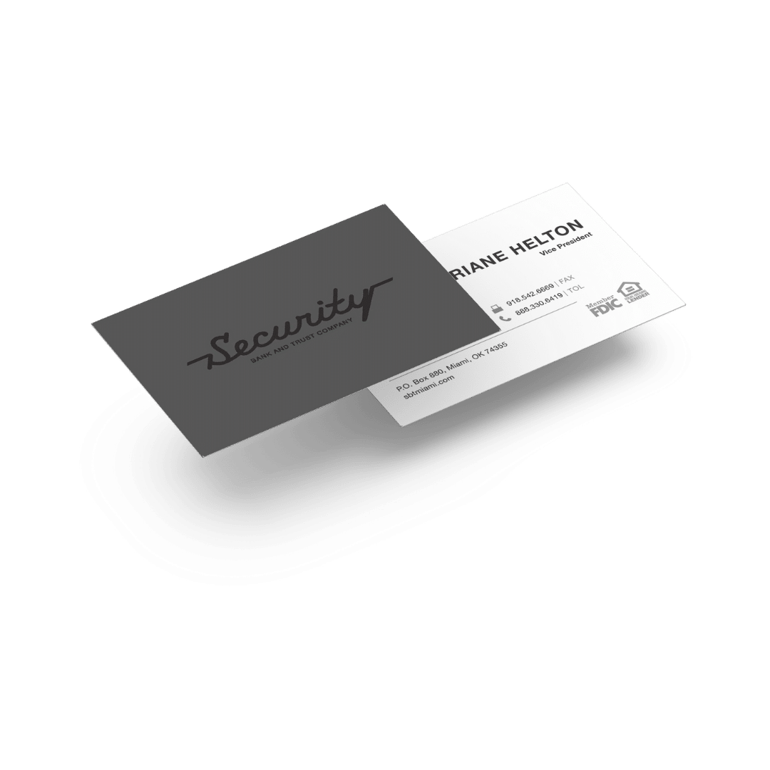
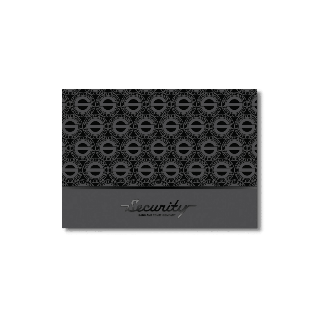
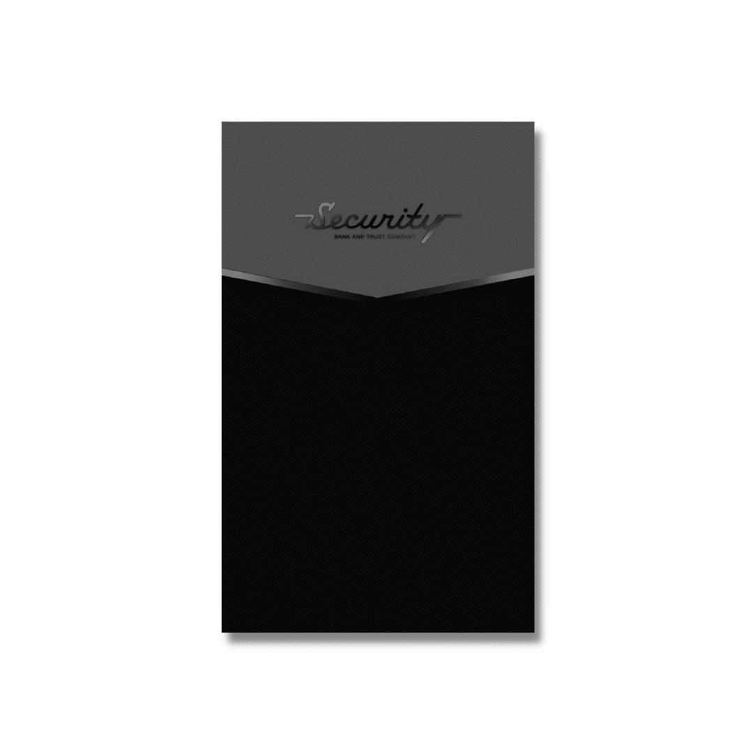
security bank & trust company

WEBSITE DESIGN | BRANDING | COLLATERAL AND GRAPHIC DESIGN

SBT-Mockup

We worked with Security Bank and Trust Company (Miami, OK) initially on their brand identity and followed up with various design projects and their banking website. Our goal from the start has been providing a recognizable brand for their business and seamless site usability for their customers. 

PROCESS

Our relationship with Security Bank and Trust has been growing over the years. We started working on smaller design projects and, while updating brand guidelines, we began working on a website that would integrate with their online banking platform and be more user-friendly for their customers. Here are just some of our projects, which in this case, began with our role in helping them with their branding:
SBT-Mockup

website design

We worked with SBT to replace their existing site and design and develop a more robust user website. Like so many businesses, SBT had been using a predetermined template that didn’t allow for flexibility or a true reflection of their role as an institution focused on their local community. We were able to highlight all the different banking products they can offer to their customers on the website, and we wrote copy for the entire website to capture their commitment to their local clients. 

We made certain that the new site we created integrated with their existing online banking software, and ensured that SBT’s digital presence was brought in line with their brand standards. Their new custom site better reflects the level of service and custom personal finance solutions that they offer their customers. It helps them stand out in a competitive area, especially when up against large well-known financial institutions

SBT-Logo

branding

Like many companies, SBT struggled over the decades with consistency in using their logo—updating it, yet older logos never fully retired and creeping up—and their style throughout their branding and marketing.  We believe that it’s important to have a clear, concise reference point across all communications to say that:
  • this is our logo
  • these are our fonts
  • this is our color scheme
Capulin Creative worked with SBT to develop brand standards (font, color, size, usage, etc.) based on their logo, style, and aesthetics.
We created a comprehensive brand manual to help them easily stay on brand throughout all their customer touchpoints. Initially, we assessed their brand personality and incorporated it into their updated brand identity. We wanted the colors, fonts, and overall visual aesthetic to reflect the modern, competent, innovative, and forward-thinking business that they are in their branding. It was also important to keep it anchored to their community and to honor their history as well. 
Business-Cards-SBT
Thankyou-card-SBT
Folders-SBT

collateral & graphic design

Over years, we have helped with various graphic design and collateral projects, such as signage, sponsorship programs, and brochures. We have also designed corporate stationery and other projects. As with many of our clients, especially those with whom we have been integral in helping build or solidify their brand, we love helping them take their branding and marketing message across multiple channels.

When SBT needed a new sign for the drive-up ATM, we partnered with a local sign shop, overseeing brand standards and creating and providing artwork.

Other Projects

Check out similar projects we have done for other businesses

GET STARTED WITH A FREE PROPOSAL.